Window Tinting Phoenix | The New Logo:
-
- I am not a graphic designer, nor would I ever claim to be! After several days and countless hours, I have finally completed my new logo. With the exception of my very first logo (2007-2009), I have created on my own using some minimal Photoshop experience. I felt like my then current logo from 2016 needed a nice overhaul so I contacted someone on Fiverr to create a logo based on some information given by me. What they returned wasn’t exactly what I was seeking. I wanted something new, refreshing and definitely an improvement from the last logo I had created. Now, they do include unlimited revisions, but there was nothing to revise… It was either pay more money and hope they could come with with some better concepts or I once again take a shot at creating my new logo.
- I am not a graphic designer, nor would I ever claim to be! After several days and countless hours, I have finally completed my new logo. With the exception of my very first logo (2007-2009), I have created on my own using some minimal Photoshop experience. I felt like my then current logo from 2016 needed a nice overhaul so I contacted someone on Fiverr to create a logo based on some information given by me. What they returned wasn’t exactly what I was seeking. I wanted something new, refreshing and definitely an improvement from the last logo I had created. Now, they do include unlimited revisions, but there was nothing to revise… It was either pay more money and hope they could come with with some better concepts or I once again take a shot at creating my new logo.
-
- So I took a deep breath and went to work. I had the idea of flipping the last “E” in Eclipse backwards to frame the word and give it a unique appearance. Obviously, flipping letters in a word is not an original idea, just ask my buddies over at the band Korn! With my first go around, I was pleased…but something just wasn’t quite right.
-
- Back to the drawing board. I now had a decision to make. Do I keep running with my idea, or scrape it for a new one. Since I am not a graphic designer at heart, it is difficult for me to visualize a finished product. All I can do is tinker with ideas and see how it forms and progresses. Making a few more adjustments, I came to a logo that I was very pleased with and even added to my website as my new logo header. But, my journey was not over yet….
-
- A few days later…I hated it. I felt it had all the elements that I was looking for, but something still seemed off. When I contacted the artist on Fiverr, I told them I was looking for something “edgy“, and what I had made was not edgy. About 3 years ago I created a logo that had too consumed many hours of my life. I’m not sure what it was, but for some reason I mentally rejected it and it never saw life on my website or any print marketing.
-
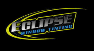
- My vision is about to come full circle! I was finally able to visualize my end result, so I went to work for the last time…hopefully. Taking the swoosh element from my concept and adding it to my newly changed font and design, I applied some additional filters and tweaked some colors. I saw something that I was truly proud of. I finally have the cool, edgy logo that was tucked somewhere in the back of my mind, it just took 2 weeks and many, many, hours to surface.
